Painting My Studio – 31 Days of Color

I am obsessed with color. If you ever see someone walking down the street in springy green pants, or wearing a deep blue pullover, or sporting purple glasses . . . well, that could easily be me.
Not only do I love color in the clothing I wear, but I love it in my home decor. Having gorgeous, bright colors around makes me happy and improves my mood! Does it do that for you?
The only issue with being color obsessed is that my better half Steve and I don’t necessarily see eye-to-eye. So while we’ve been in our studio for over a year now, we had yet to paint until just recently . . . and I’m pleased to report that the change happened thanks to Valspar and Ace Hardware!
Last year I participated in Ace Hardware’s 31 Days of Color with their exclusive Valspar paint line, and I’m thrilled that I get to participate again this year with some painting in my studio.
If you haven’t heard of the 31 Days of Color, it’s a month of painting tips and inspiration (along with help) via Ace Hardware’s ThePaintStudio.com. Not everyone is an expert with selecting color and learning how to paint; I’m definitely not. This is your opportunity to learn through these amazing tips and tools online.
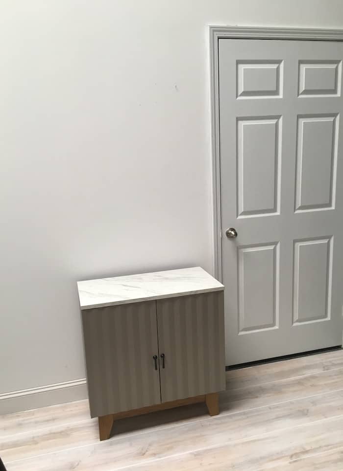
So back to my studio. This is the wall I’ve been staring at forever, and the place I wanted to start with a little bit of paint. It’s toward the front door of the studio, and I wanted to turn it into a receiving area for guests . . . a little lounging spot where I could hang a mirror and place some of my favorite furniture pieces.
Since I work at the studio several days a week, I want it to feel like home instead of a large warehouse space!
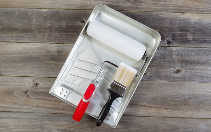
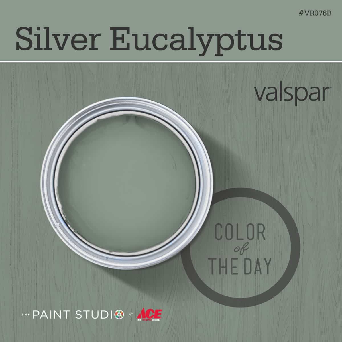
I visited Ace and grabbed the supplies I needed for my wall in no time – including my exclusive Valspar paint. What color did I decide to go with? It’s called Silver Eucalyptus, and it’s gorgeous!
It’s not a “bright” color, but what I love about it is that it’s a very rich color that goes with all of my home decor pieces that I wanted to include.
Knowing that it was Valspar paint was important to me, as they are company that has been around for over 200 years and always provides the best paint in the highest quality. What else do I love about Valspar?
- They have a wide variety of products for any project need, interior and exterior.
- They provide superior color matching
- They have a “Love Your Color Guarantee” – meaning if your first color isn’t right, you can have another free (make sure to read the terms & conditions).
Once I got all my supplies organized, I poured my paint in the tray and got to it. I absolutely loved how the paint rolled on – it was so smooth. My paint was also the perfect thickness as well – not too thick to roll onto the wall, but not too thin to drip. I didn’t have any drips.
That perfection of consistency is really hard to achieve, but Valspar has done it! I put two coats on my wall. The coverage was so good, I felt like I didn’t need two coats – but I did it just to be safe. It didn’t take long.
You just can’t beat Valspar. Trust me! And I think that is evident in the final reveal of my studio wall:
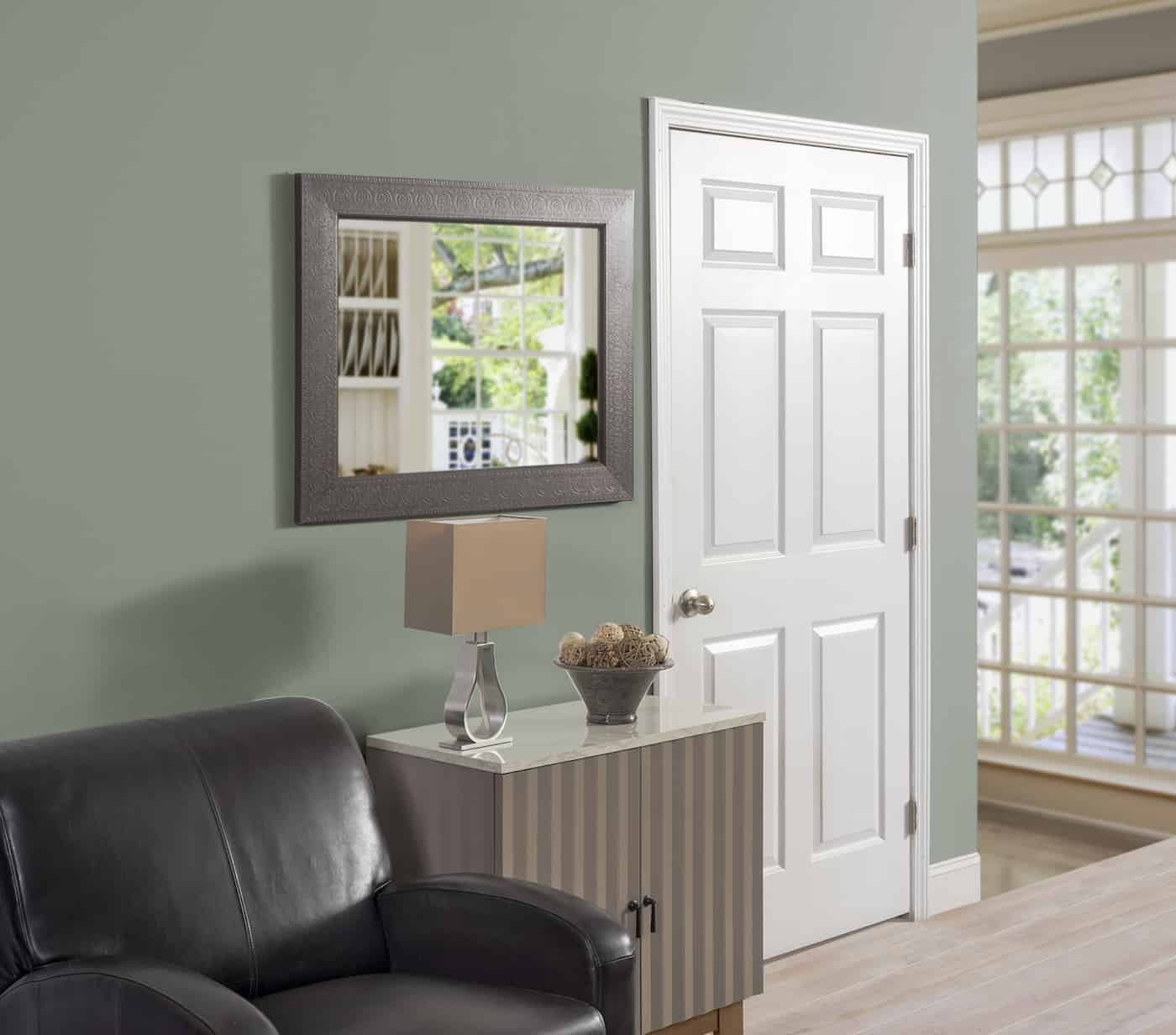
Isn’t it awesome?!! I’m so thrilled – and I love that it gave that “at home” feel to an otherwise boring workspace. I hope you love it too.
Now I have a question for you – where could you use a bit of color to brighten up your home?
Disclosure: Valspar partnered with bloggers such as me for their 31 Days of Color program. As part of this program, I received compensation for my time. All opinions are 100% mine.

I love that color. Maybe will put that in my living room, but don’t know if my yellow buffalo check curtains would go well with it. I would love your opinion on that.
Hi Patricia! Knowing what this color looks like on my walls, my guess is the yellow buffalo check won’t go together well. Having said that . . . some white buffalo check curtains would look great! I’m a buffalo check fan myself <3
Do you think this is a true sage color? And what do you think of this being an accent with all other walls being calfskin by valspar?
Hi Christie! It’s hard to answer because everyone sees color a bit differently, but to me it is kind of a dark sage. True sage, in that it has gray in it, but dark sage. And yes I think it would be a great accent with the Calfskin! The lampshade in one of the pictures is around that shade to me and I think they go well together.
Hi! I love love this color! I have coffee bean ( dark brown)leather furniture in my living room. Do you think this Silver Eucalyptus would go well as an accent wall ? I’m also wanting a light gray for the rest of the walls in living room which is open to dining room. Also down the hallway and possible stairway walls. I would love to hear your suggestions! Thank you!
I love this post. The color is gorgeous! I’m trying to figure out what color to go with in our master bedroom. Our house is 70 years old. I am wanting to find a romantic, amorous color that will also be conducive to sleep, of course, but will not be too dark for the room. I was leaning towards dusty purples but cannot seem to commit. I love Valspar paint and colors also but I’ve not managed to narrow this down yet.
Love the color! I think I will try the silver eucalyptus color in my entryway…
Hello, I’d love to use this colour for a feature wall, what white or cream colour would you use to compliment this silver eucalyptus?
I like Greek Villa personally! It seems to go with everything. But I haven’t used it with this color, so I’d double check the paint chips 😀
I love that colour! Your after is gorgeous, Amy!